And we are live!
Launching our logo and website
It’s finally here! We have a beautiful logo for Galiot Press, designed by Karen Stein Shanley and her team at the brilliant goodgood design studio. We love the logo for the way it turns the initials of our business name into slightly stylized shapes, leaning towards the modern while also evoking a classic font. And on top of that, the shapes remind us of punctuation marks, perfect for a publishing company. We think this logo is going to look great on the spines of the books we’ll be publishing, on t-shirts, on mugs, on notebooks. Imagine a shelf full of Galiot Press books with this logo, all lined up in a row, inviting readers to open them up and find writing that emerges from the intersection of cultures and currents.
Our preliminary website is now up and running. Take a look! In the spring, when our full site is up, you’ll find our system for submitting work (agented and un-agented), and detailed information about the ways in which Galiot Press re-envisions every aspect of the publishing process, from manuscript acquisition to reader engagement.
We’ve embarked on our efforts to raise our start-up and sustaining costs. If you’d like to support Galiot Press by becoming a patron, feel free to upgrade to a paid Substack subscription. Thank you!
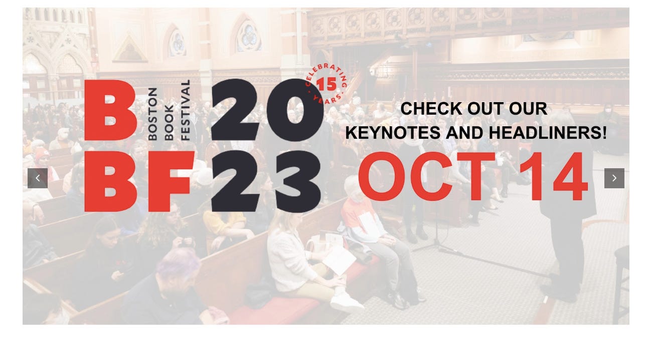
Meantime, we are starting to get out there, beginning with regional events. Anjali will be attending the New England Independent Booksellers Association fall conference in Providence, RI October 3-5, and we will have a booth (shared with Solstice Literary Magazine) at the Boston Book Festival on October 14th. The Festival will be our first official event as an exhibitor, so if you are in the area, please stop by and give us some love! We can’t wait to chat with everyone and share our plans.


